Image courtesy of TCGdex.net
Dipplin in Focus: Composition and Perspective in Pokémon TCG Art
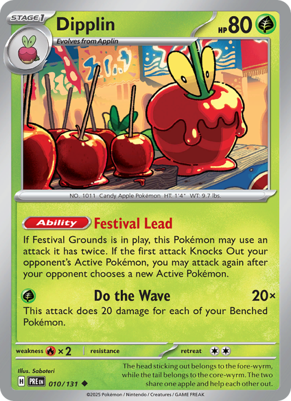
In the vibrant tapestry of the Pokémon Trading Card Game, art is more than decoration—it’s a visual language that communicates strategy, atmosphere, and story at a glance. Dipplin, a Grass-type Step-in evolution from the Prismatic Evolutions set, offers a masterclass in how composition and perspective guide the eye, frame gameplay, and spark nostalgia for players and collectors alike ⚡. Designed by Saboteri, this Uncommon Stage1 card (SV08.5-010) packs a gentle dynamism into a scene that feels almost like a moment frozen in a sunlit meadow, just before a wave of energy ripples outward.
First, let’s anchor ourselves in the card’s concrete data. Dipplin is a Grass-type Pokémon with 80 HP, staged as a Stage1 evolution in the Prismatic Evolutions arc. Its ability, Festival Lead, hints at a playful festival ambiance—“If Festival Grounds is in play, this Pokémon may use an attack it has twice. If the first attack Knock Outs your opponent’s Active Pokémon, you may attack again after your opponent chooses a new Active Pokémon.” This strategic twist isn’t just a rule; it informs how the art can tell a story of momentum and potential in a single frame. Its attack, Do the Wave, scales with your Benched Pokémon: 20 damage for each Benched Pokémon, a mechanic that visually aligns with the idea of an expanding, rhythmic surge—perfect for the ripple-like curves that sweep across the illustration. Dipplin’s retreat cost sits at 2, and the card bears the Regulation Mark H, keeping it legal in Standard and Expanded play as of the latest updates. Saboteri’s illustration captures not just a moment but a sense of field-borne possibility that mirrors the card’s mechanics 🧭.
A deliberately dynamic composition
In the artwork, the eye is guided along a gentle, spiraling path that mirrors the card’s own looping potential. Dipplin is placed with a slight off-center bias, which creates a sense of forward motion—an intentional choice that mirrors the attack’s scaling with the Benched Pokémon. The surrounding environment uses negative space and soft gradients to keep Dipplin readable while suggesting a larger arena beyond the card’s borders. This composition respects how players visually parse the game: the central figure remains readable at a glance, while the implied space around it hints at a crowded battlefield of strategies and counters. Saboteri’s linework feels confident yet playful, underscored by a color language that leans into grassy greens and sunlit yellows to evoke a warm, game-ready atmosphere 🔥.
Perspective that invites interaction
Perspective in this piece isn’t about dramatic foreshortening; it’s about inviting the viewer to imagine the action beyond the frame. The artist employs a low-to-mid vantage that keeps Dipplin’s form approachable—the kind of angle a player might feel when translating the card’s energy into real-game movement. Subtle perspective lines in the grass blades and leaves lead the eye toward Dipplin’s face and posture, which radiates curiosity and readiness. The result is a card that feels interactive before you even read the stats: you sense that this Grass-type’s confidence is contagious and that the battlefield ahead is about to ripple with coordinated plays once Festival Grounds is in play. It’s a gentle reminder that TCG art can be as much about strategic mood as technical detail 🎨.
Color, light, and a sense of place
Dipplin’s palette leans into soft greens, teals, and botanical highlights, punctuated by warm light that suggests a midday glow. This choice isn’t cosmetic; it influences how players perceive the card’s “readiness” and approachability. The interplay of light on Dipplin’s form helps separate the creature from the grassy backdrop, maintaining legibility even as the scene hints at a larger, festive setting. Saboteri’s brushwork—curved, organic lines with careful shading—gives Dipplin a tactile presence, as if you could reach out and feel the leaf textures and the gentle fuzz on its body. In the broader context of art direction, the piece mirrors a long-standing Pokémon tradition: balance whimsy with clarity to translate complex mechanics into a single, memorable moment ⚡.
How this art informs gameplay perception
Beyond aesthetics, the composition speaks to how players internalize Dipplin’s potential. The very idea of “Do the Wave”—20 damage times the number of Benched Pokémon—emerges visually as a radius expanding from a central point, much like the visual breath of the artwork. The implied energy radiates outward, echoing how a well-timed Festival Grounds interaction can multiply the impact of an attack. The art, therefore, becomes a mental model for players planning bench strategies, tempo plays, and timing. In Saboteri’s hands, Dipplin stops being a line on a card and becomes the spark that suggests a sequence of confident, multi-hit turns 🧩.
Collector’s note: rarity, variants, and value hints
As an Uncommon from the Prismatic Evolutions set, Dipplin sits at a sweet spot for collectors who appreciate thoughtful card art without the sticker shock that rarer holo cards can command. The card exists in multiple variants, including normal and holo versions, plus reverse holo and other print formats, which broadens the entry points for collectors and players alike. Current market data (CardMarket) shows a modest baseline with holo copies typically fetching a higher average price—around €0.12 on average, compared with about €0.04 for non-holo copies—reflecting the usual premium for shine and collectability. The holo trend shows a sharper upward pulse in short windows, underscoring how presentation can influence perceived value even in smaller, fan-favorite Pokémon like Dipplin. This is a gentle reminder that artful cards like this aren’t just for display; they’re keepsakes that carry gameplay memory wherever they travel ✨.
For fans of Saboteri’s work and the broader prism of set design in Prismatic Evolutions, Dipplin offers a crisp example of how composition and perspective serve as a bridge between a card’s mechanical identity and its emotional resonance. The art’s celebration of light, space, and motion complements the creature’s greenscape identity and the strategic rhythms of its moves, inviting both competitive play and quiet appreciation on the shelf. If you’re curating a collection that respects both gameplay function and narrative depth, Dipplin is a small but mighty gem to consider, especially in holo or reverse-foil forms that catch the light the moment you flip the card in your binder 🔎.
Phone Case with Card Holder MagSafe – Gloss MatteMore from our network
- https://blog.zero-static.xyz/blog/post/humor-driven-art-direction-for-erdwal-ripper-in-commander-decks/
- https://blog.digital-vault.xyz/blog/post/frillish-regional-art-waterghost-style-variations/
- https://blog.digital-vault.xyz/blog/post/luminous-blue-giant-revealed-by-dr3-11800-light-years-away/
- https://blog.zero-static.xyz/blog/post/coastal-wizard-rarity-unveiled-print-runs-across-sets/
- https://blog.digital-vault.xyz/blog/post/vintage-botanical-digital-paper-packs-for-creative-projects/