Image courtesy of Scryfall.com
Card Frame Evolution in MTG: A Battlewand Oak Perspective
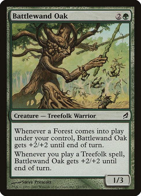
Magic: The Gathering has always been as much about the aesthetic language of its cards as the mechanics behind them. The frame around a card is a visual cue, a tiny piece of poster design that whispers what era you’re playing in and what kind of gameplay you’re about to experience. Battlewand Oak, a green Treefolk Warrior from Lorwyn, sits at a fascinating crossroads for frame design. It wears the classic frame that Scryfall identifies as “frame 2003,” a style that bands together readability, color identity, and the art in a way that many players fondly remember from their early MTG years 🧙♂️🔥. The card itself—mana cost {2}{G}, cmc 3, 1/3 body, with triggers that care about Forests and Treefolk spells—reads as a bridge between landfall-style tempo and tribal synergy, a perfect case study for why frame design matters as much as the card text.
Frame evolution in MTG has tended to alternate between function and flavor. Early frames emphasized heavy borders, bold serif fonts, and a darker, denser reading experience. As sets progressed, designers experimented with border thickness, color-shaded mana symbols, and more generous text boxes to improve legibility across increasingly complex card interactions. Lorwyn, the block that introduced Battlewand Oak, arrived with a subtle but meaningful shift: a brighter, more cohesive surface that complements painterly art and a lighter, more modern aesthetic. The 2003 frame style—still in use for this card print—reads well on both paper and digital renders, a testament to how frame choices can survive print cycles while continuing to feel contemporary for new players. The evolution didn’t erase history; it built on it, preserving the nostalgia of the old border while pushing for cleaner text and more readable stat lines 🎨⚔️.
Battlewand Oak’s design highlights a gentle tension between its surface and its soul. The art by Steve Prescott captures a stoic Treefolk guardian, a sentinel of the forest with a wand-like staff that hints at its name—an image that resonates with the lore of Lorwyn’s verdant planes. The card’s mechanics reinforce that feeling: when a Forest you control enters, Battlewand Oak gets +2/+2 until end of turn, and when you cast a Treefolk spell, the same buff applies. It’s a compact reminder that in MTG, the frame is not just a border; it’s a framing device for the card’s story and strategy. In modern play, the synergy reads cleanly on the page, and the frame’s contrast ensures the text is legible even as you tilt a few forests onto the battlefield with wild enthusiasm 🧙♂️💎.
From a gameplay perspective, the card’s size, color identity, and text layout benefit from the older frame’s sturdy readability. Green cards rely on lush, natural imagery, and the frame helps keep the forest-green mana pool visible at a glance. The emphasis on triggers—entering Forests and casting Treefolk spells—lands in a way that feels intuitive when you’re assembling a board state. That clarity is precisely what a well-designed frame should deliver: your brain processes the info faster, your turns feel smoother, and your beard-stroking friend can appreciate the artistry without squinting at the text box 🧙♂️🎲. It’s also worth noting that Battlewand Oak exists in both nonfoil and foil finishes, a small but telling nod to how collectors value frame-preserving variants: foil tends to capture more of the watercolor glow in the Lorwyn era while nonfoil keeps a more classic, budget-friendly presence for themes and budget builds 🔥💎.
Frame evolution isn’t just about cosmetics; it’s about accessibility and cultural memory. The Lorwyn line, including Battlewand Oak, sits in a space where the art’s brightness and the border’s simplicity work together to evoke a sun-dappled grove—an intentional contrast to the heavier, older frame styles. Designers watching MTG’s frame journey note how the modern emphasis on contrast and legibility supports new players who are acclimating to complex triggers and layered abilities. The card’s two triggers—one tied to lands entering and another tied to a tribe’s spellcasting—are a neat microcosm of how frame readability supports multi-part interactions without forcing you to squint at the margin notes. In short: the evolution of the frame has walked a line between nostalgia and practicality, and Battlewand Oak proves you don’t have to abandon the old look to welcome the new light 🧙♂️🔥.
For fans and collectors alike, the card’s value is a reminder that a frame can carry as much character as the creature within. While 1/3 for three mana is modest by today’s power scale, the card’s flavor, art, and the frame’s history give it staying power across formats. It’s a common green card with a foil showing some lift in value—readers of price guides will note the foil is typically a modest premium, while the nonfoil remains an approachable entry point for players who want to dip into Treefolk tribal ideas without breaking the bank. The balance of color, mana, and mechanical triggers makes Battlewand Oak a reliable pick for casual multiplayer nights and flavor-focused deck-building alike 🧙♂️⚔️.
If you’re a MTG enthusiast who loves the tactile joy of baby-smooth foils and the aesthetic of classic frames, consider how your own collection could reflect frame history. A neat, display-friendly Neon Card Holder Phone Case—our featured product—might be the perfect companion for keeping your favorite deck cards and travel-ready sleeves crisp and vibrant. It’s a playful nod to the modern collectorship that loves both function and flair, just like MTG’s evolving frames themselves.
Neon Card Holder Phone Case