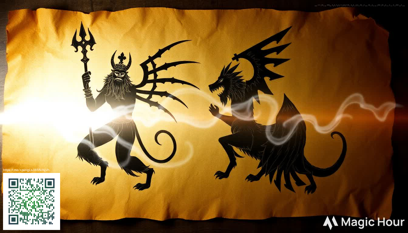
Fear in 16-Bit: The Allure of Pixel Art Horror Games
Pixel art horror games lean into nostalgia while delivering fresh frights through deliberate design. The constraints of 16-bit visuals—limited color palettes, chunky sprites, and the careful use of negative space—force developers to lean into suggestion rather than explicit detail. What you don’t show often becomes more unsettling than what you do. That tension between retro charm and modern atmosphere is at the heart of why pixel art horror remains so resonant, even as players increasingly expect cinematic polish in other genres.
In this space, sound design and pacing are as crucial as the pixel grid. A minimal soundtrack, paired with environmental audio that hints at danger, can make a dimly lit corridor feel endless. Gesture and silhouette carry meaning: a single flicker of light, a sprite that lingers just beyond the corner, or a door that never fully opens. These elements invite players to fill in gaps with their own nerves, and that participation is where fear becomes personal.
In pixel horror, silence is a weapon as much as a soundtrack—because what you don’t hear often signals what you can’t see.
Visual language: shadows, silhouettes, and the power of implication
When you strip away detail, your brain does the heavy lifting. Designers exploit this by crafting strong silhouettes and suggestive textures. A door with jagged edges, a hallway that narrows as you progress, or a wall that looks intact from afar but crumbles on closer inspection—all of these choices create a sense of risk without shouting it out loud. Color psychology matters too: high-contrast palettes can heighten tension, while desaturated scenes invite a creeping unease that lingers after the screen goes dark.
For players who crave atmosphere over spectacle, this approach can feel more immersive than modern hyper-real graphics. The pixels become a canvas for your imagination, and the fear you feel is shaped by how your mind fills in the gaps.
Design lessons you can borrow for your own project
- Let silhouettes tell the story: Use bold outlines and distinctive shapes to communicate danger without clutter.
- Embrace a restrained palette: A handful of colors can be more powerful than a full spectrum when placed with intention.
- Play with pacing: Moments of stillness contrasted with sudden, minimal movement amplify suspense.
- Layer audio strategically: Simple sound cues—footsteps, a distant scream, a creaking floor—can be more chilling when they’re just barely audible.
- Reward curiosity, not recklessness: Let players explore, but establish consequences that feel meaningful within the world’s logic.
If you’re brainstorming a late-night session or a small indie project, a thoughtful desk setup can matter as much as the game itself. For a desk that keeps you comfortable during long sessions, consider the Custom Neon Mouse Pad 9.3x7.8 Rectangular Desk Pad. A tactile, well-sized surface can reduce fatigue and help you stay immersed in tense, pixelated environments. For a quick visual reference to this aesthetic, see the gallery at https://diamond-images.zero-static.xyz/fae833e9.html, which captures the mood and vibe many indie developers chase when crafting retro horror experiences.
Ultimately, pixel art horror is less about the precision of the pixels and more about the precision of your perception. The art form teaches that fear can be built from constraint, not excess—that less can be profoundly more when you design with intent.