Image courtesy of Scryfall.com
Traditional vs Digital Illustration: A Case Study in MTG Art on a Conspiracy Classic
Art in Magic: The Gathering is more than decoration; it’s a gateway to the set’s lore, a mood board you feel before you ever read the card text. When we compare traditional and digital approaches, the conversation often centers on texture, atmosphere, and how quickly an artist can translate a complicated concept into a single moment on the battlefield. Take, for example, a Conspiracy staple with a double agenda in its DNA. This card’s aura—its secret purpose and the hint of two intertwined destinies—lends itself to a visual language that can swing either toward tactile brushwork or luminous, layered digital polish. 🧙♂️🔥💎
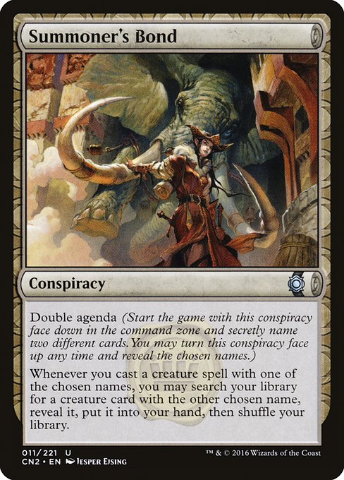
From the Conspiracy: Take the Crown era, Summoner's Bond sits in the unexpected niche of a conspiracy card, unbound by typical color identity and priced in that rarefied zone where lore and play intersect. The artist, Jesper Ejsing, delivered a piece that captures the card’s flavor: a moment of arcane planning where a spellcasters’ network of names quietly forms a plan as two destinies collide. The card’s type is Conspiracy, and its oracle text carves out a philosophy of hidden intent: you secretly pick two different card names and, when you cast a creature spell with one of those names, you may search for the other. It’s a rule set that rewards patience, misdirection, and a mind tuned to see connections where others see only surface. 🧙♂️🎲
“In art, as in conspiracies, the magic often lies in what you don’t see at first glance.”
Digital and traditional methods each offer distinct virtues for this kind of subject. Traditional painting—whether oils, inks, or watercolors—tends to bring a tactile sense of weight: brushstroke energy, grain on the page, and a handcrafted warmth that invites you to linger. In a piece that hints at hidden plans and the moment of revelation, those tactile cues can emphasize the moment of recognition when the second chosen name is revealed. On the other hand, digital illustration shines with controlled luminosity, crisp linework, and the ability to layer glow and sigils in a way that can feel almost secret-enshrouded—perfect for a card about dual destinies and concealed agendas. The Conspiracy set’s frame and design language already lean toward the theatrical; digital tricks can push the glow of mana or the shimmer of a ritual circle beyond what traditional media might render in a single pass. ⚔️
Artistic approach: traditional vs digital
- Traditional impressions: Rich texture, visible brushwork, and warmth that makes magic feel tangible. The human touch of a painter can imbue the scene with a sense of history—perfect for a card that exists in the margins between deliberate secrecy and grand design. 🎨
- Digital conveniences: Precision in linework, seamless color transitions, and the ability to weave multiple light sources into one composition. For a card about two names and the search for a partner card, digital layering helps artists hint at hidden connections without clutter. 💎
What makes this particular piece sing is how it threads the theme of a hidden agenda into the visual language. The artwork speaks to the tense moment of choice—an invitation to look closer and consider what is being orchestrated behind the scenes. In that sense, traditional and digital approaches are not rivals here but two routes to the same punchline: magic that invites scrutiny and rewards careful observation. 🧭
Designing for strategy and lore
Summoner's Bond lives in a space where lore and board decisions collide. The conspiracy mechanic rewards players who track narratives across games and cards, a flavor text in motion. The absence of color in this card (no mana cost shown on the surface) and its Conspiracy frame foreground the idea that the art exists to cue strategic storytelling—two names, two paths, a moment when you must reveal one to fetch the other. The Conspiracy set’s play environment—drafts, unusual openings, and the thrill of a secret identity—finds a natural ally in a piece that leans into mood and misdirection as much as into literal action. ✨⚔️
From a collector’s angle, the art’s execution also matters. This card is Uncommon in the CN2 set and printed as both foil and nonfoil, which means more players can enjoy its lore-rich portrayal of double possibilities. While market prices may drift (Scryfall notes a modest value today), the true premium rests in how the artwork invites you to imagine the moment just before the second name is revealed. If you’re a fan of the confluence between artistry and play, this is a piece that rewards careful study, whether you’re building a conspiracy-themed deck or simply admiring the craft. 🧙♂️🔥
And for fans who like to blend their MTG passion with real-world gear, there’s a tactile companion in the real world—the Neon Clear Silicone Phone Case. It carries the same neon energy that animates digital art, a playful crossover that suits the bright, modern aesthetic many MTG enthusiasts love. A little color, a little protection, a lot of charm—perfect for geeking out about two different card philosophies at once. 🎲
Neon Clear Silicone Phone Case – Slim, Flexible ProtectionMore from our network
- https://blog.digital-vault.xyz/blog/post/silent-hot-giant-illuminates-faint-end-of-the-completeness-map/
- https://blog.digital-vault.xyz/blog/post/how-null-elemental-blast-mirrors-its-planes-culture/
- https://crypto-acolytes.xyz/blog/post/collecting-arcade-marquees-history-value-and-display-tips/
- https://transparent-paper.shop/blog/post/mastering-long-term-maintenance-planning-for-lasting-asset-reliability/
- https://blog.digital-vault.xyz/blog/post/henge-of-ramos-balancing-randomness-and-skill-in-land-strategies/