Designing Screens That Draw Players In
In a bustling arcade hall, attraction screens are the first handshake with a player. They must grab attention, convey the vibe of the game, and promise a quick payoff before the eye moves on. The artistry here blends bold color, legible typography from a distance, and a rhythm that feels alive even when the machines are idle. When you study successful screens, you notice a choreography: it’s not just what is shown, but when and how it appears.
Beyond aesthetics, the psychology of a screen matters. Vivid hues create contrast against dim surroundings, while a well-chosen typeface ensures legibility across different viewing angles. The most memorable attract screens balance fast-moving elements with readable prompts—think flashing callouts that indicate “Play Now,” or a simple, friendly instruction that reduces hesitation. The overlay imagery you see in modern setups often includes dynamic cues—light trails, subtle pulsations, and compact cues that guide the eye toward the action without overwhelming the viewer.
“A great attract screen works like a well-tunded instrument: it sings just enough to capture interest, then hands the baton to the game itself.”
Key visual principles to guide your design
- Contrast and color theory: Use high-contrast palettes to stand out in low-light environments, but avoid eye fatigue by limiting color saturation and preserving breathing room around focal elements.
- Typography for distance: Opt for bold, sans-serif headlines with ample letter spacing and generous line height so messages read quickly from across the room.
- Hierarchy and focal points: Establish a clear hierarchy so the most important action—“Play Now” or “Insert Coin”—is instantly recognizable.
- Motion with purpose: Subtle motion draws attention without inducing nausea; think gentle pulsing, micro-animations, or a fade-in of key details.
Layering content: text, imagery, and interactive cues
The best attract screens compress information into digestible bites. A striking hero image or icon can telegraph the game genre in one glance, while supporting copy clarifies the stakes. Overlay elements—like quick how-to steps or a countdown—add urgency without clutter. If you’re prototyping, consider a modular approach: a bold banner, a central graphic, and a footer strip for instructions. The aim is to maintain clarity even when the audience is moving, talking, or waiting for a turn.
For players who value precision during extended sessions, a reliable, tactile setup behind the scenes can help keep the experience consistently engaging. If you’re curating a space that supports both casual newcomers and seasoned players, you might find practical value in gear that enhances control and comfort. For instance, a dependable Non-slip Gaming Mouse Pad—readily accessible at the product page here—helps maintain consistent cursor accuracy during rapid on-screen action, ensuring that the visual callouts line up with player intent. It’s a reminder that great attract screens pair strong design with thoughtful hardware context.
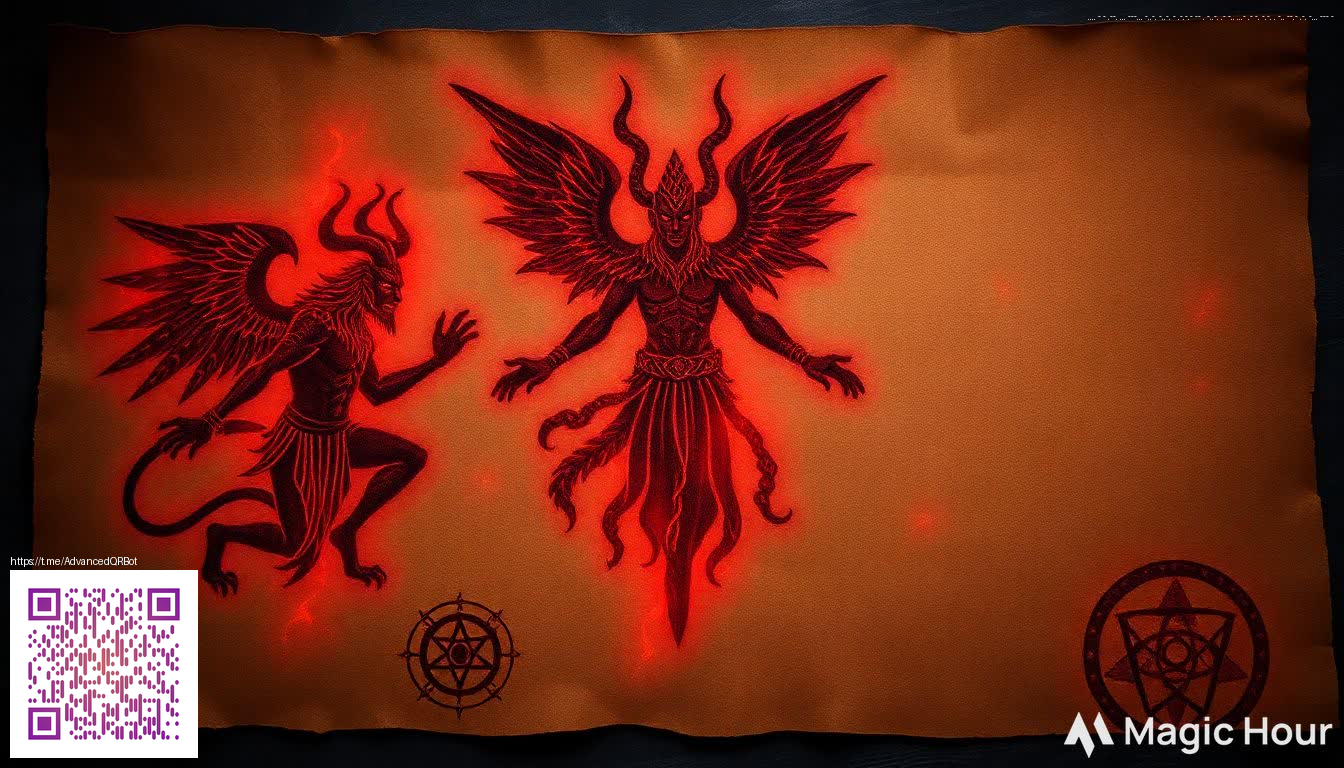
Another layer worth considering is the integration of QR-like cues and quick-access prompts. The overlay artwork in this example illustrates how a compact, scannable motif can coexist with bold typography and a clear call to action. When done well, such cues feel native to the screen—not gimmicky—serving as a bridge between the moment you see the display and the moment you decide to engage.
Interactivity, sound, and rewards
- Approachability: Use friendly language and visible play indicators to invite newcomers.
- Feedback: Immediate visual and auditory feedback after a user action reinforces their choice and reduces hesitation.
- Rewards: Short, perceivable rewards (even if just a momentary flourish) can increase the likelihood of a subsequent visit to the machine.
When designing for a shared social environment, it’s crucial to calibrate sound design and motion so they complement rather than overwhelm neighboring machines. A well-balanced attract screen respects the crowd while still shining a spotlight on the game’s personality. The result is an environment that feels both electric and approachable, inviting curiosity without demanding it.
From concept to production
Start with a mockup that prioritizes readability at distance, then test across devices and lighting conditions typical of an arcade. Iterate on color, type, and motion until the composition reads as a single, confident statement. Finally, ensure your assets are optimized for real-time rendering, so even on older hardware, the attract screen remains crisp and responsive. The right balance of artistry and engineering creates a display that not only attracts attention but sustains it for meaningful engagement.